Do you like sex, violence, and exorcisms? Close this tab if you don’t, because Murder Vibes From the Monster Dimension! goes all-in with all three. After making the fantastic and fun video for Metallica’s Spit Out the Bone, Phil Mucci’s moving from short-form to really long-form with a graphic novel that introduces us to Professor Dario Bava, former Vatican exorcist turned paranormal playboy. The book’s a first step into a much larger world that’ll involve at least one TV show. It’s also full of special features worthy of Scream Factory. Phil the Mad Monk and his creative team (Mike Dubisch, warrior illustrator, Lydia Roberts, sorceress of titles, and Dan Simpson, berserker producer) spared some time to talk to us about this and the further adventures of Bava in the Scream Factory of interviews. It’ll definitely get you excited for Murder Vibes and, hopefully, for creating something yourself. I thank them for their thoughtful answers, and thank you for reading them.
Well, time to get outta the way of this groovy read.
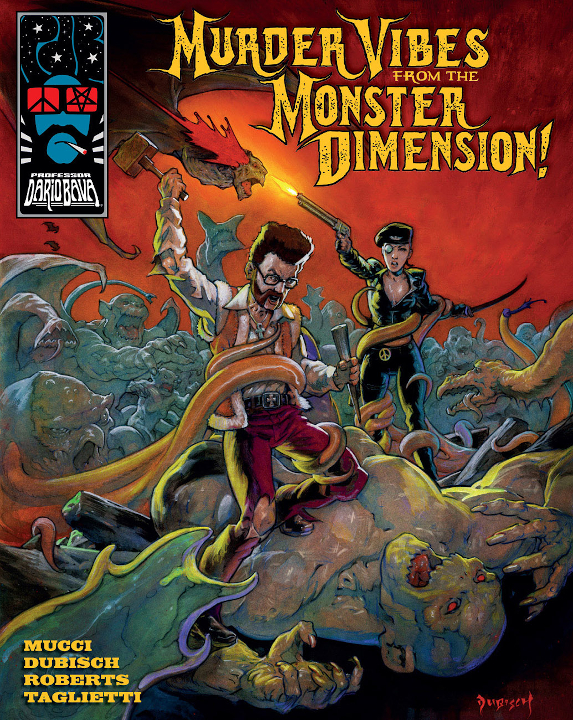
Phil Mucci’s gonna give us the gory story about how the Prof went out of his mind and onto the page, and beyond.
You mentioned in the intro that a lot of work went into the series bible of what Murder Vibes From the Monster Dimension! grew from. Could you give us a few details of what you researched as well as how you went about building the world and characters?
The series bible came after a lot of development and writing work was already done. In fact, though the character of Professor Dario Bava (PDB) first appeared in the Huntress Sorrow video (2015), the story he appeared in had been kicking around since 2007. I’d written a treatment back then for a feature called BLOOD OF THE VIRGIN’S CRYPT, which was going to be my ode to the sexy Eurosleaze horror flicks I loved. I’d recently completed my second short film, FAR OUT, which took place at a swinging Hollywood party in the late 60’s (partially inspired by Russ Meyer’s BEYOND THE VALLEY OF THE DOLLS), and I really wanted to keep playing in that world.
My biggest influences at the time were films like Mario Bava’s DANGER: DIABOLIK, BLACK SABBATH, BLOOD AND BLACK LACE, and KILL, BABY… KILL! The aesthetics of Dario Argento’s early giallos, with their funky ’70s view of cosmopolitan Rome were a style influence, and I especially loved his use color in his supernatural thrillers like SUSPIRIA and INFERNO. My interest in both directors was a springboard to discovering other filmmakers, like Sergio Martino (YOUR VICE IS A LOCKED ROOM AND ONLY I HAVE THE KEY), and Andrea Bianchi (STRIP NUDE FOR YOUR KILLER, BURIAL GROUND). I’d always been into the Hammer Horror films of the period, especially THE VAMPIRE LOVERS and TWINS OF EVIL, so I really took to the gothic horror work of Spanish multi-hyphenate powerhouse Paul Naschy. I took a lot of visual inspiration from THE WEREWOLF VERSUS THE VAMPIRE WOMAN, and even stole some plot elements from HORROR RISES FROM THE TOMB for my BLOOD OF THE VIRGIN’S CRYPT treatment! Although the style and pace of their films has little to do with Professor Dario Bava, the works of Jess Franco (VAMPYROS LESBOS, SHE KILLED IN ECSTASY) and Jean Rollin (REQUIEM FOR A VAMPIRE, FASCINATION, THE LIVING DEAD GIRL) were also a big inspiration in terms of their sexuality and surrealism. I admired them for never worrying about money, or decent scripts, as long as they had actors willing to get naked and have blood splashed on them!
All these influences and inspirations were deeply imbedded in my psyche by the time I sat down to write the scripts for PDB: Orgy of the Blood Freaks, the first season story arc for what we planned to be an animated Professor Dario Bava VOD series. I’d worked for several years on animated music videos, and wanted to take the style I’d developed a lot further. Using the basic story elements of the old BLOOD OF THE VIRGIN’S CRYPT treatment, I reimagined the story involving Professor Dario Bava with a cast of mostly new characters inspired by the actors I’d worked with. If we were going to make this thing, we’d need to rely on a cast and crew that KNEW how we worked (like maniacs) and would be excited to do it, no matter the budget!
I started writing at the end of 2015, when the 2016 presidential election was in full swing, and the crass sexism and misogyny of Trump served to remind me what I didn’t like about some of my favorite Eurosleaze flicks. Professor Dario Bava was a place to put all the things I loved, not the things I hated. As I was writing, the character of Professor Dario Bava, ex-Vatican exorcist turned monster hunter, became the battleground of two competing ideologies I’d experienced as a child: the Italian patriarchy of my father’s immigrant family, and my mother’s tough Irish feminism. The clashes I grew up witnessing around the dinner table were playing themselves out in Bava’s psyche, adding a whole new dimension to the retro horror world I was summoning. A charming but overconfident blowhard at times, Dario is constantly getting in over his head and being saved by infinitely more capable women.
The underlying themes were secondary – I mostly wrote to keep myself entertained, only outlining when I hit the action sequences. But I was creating characters that obviously had much bigger backstories than I could get into in the first story arc. In Orgy, we learn the partial history of two of the main characters, Sister Sadie and The Rider, but the bulk of the character backstories were set to be explored in later episodes and arcs, “history matters” being one of the themes of the PDB universe.
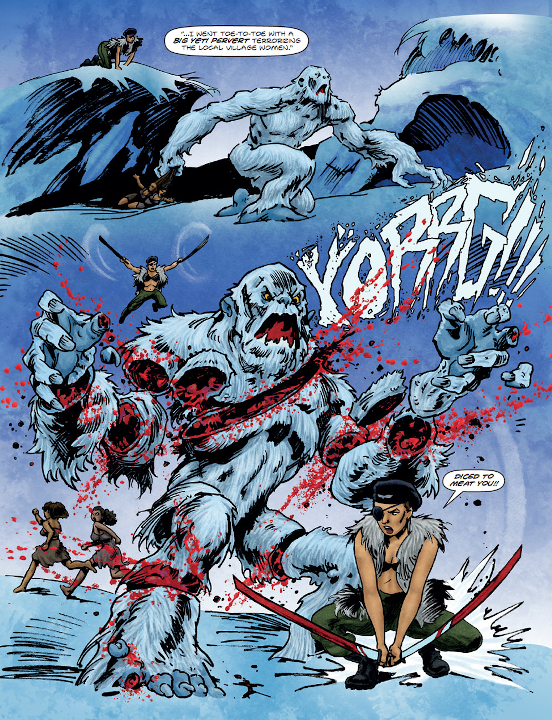
After I finished the first draft of Orgy, I took stock of the world I’d conjured and started filling in all the details I hadn’t explored – not within the script itself, but as separate backstories. It was more like how actor’s prepare sometimes – extrapolating an origin story from how the character appears in the text. I wasn’t sure when or how I would use the information, I just knew the stories had to be written.
When the script landed us a meeting at an up and coming streaming studio – much sooner than we had imagined it would – I quickly researched series bibles online. Ronald D. Moore’s series bible for his reimagined Battlestar Galactica was particularly instructive in how it was put together, though as I learned, they’re all very different. They basically outline what the show “is” – with a few rules of how the world is seen and expressed – and how the show will “evolve”. The “is” includes character histories that may or may not be explored, but give insight to the world of the show. For our uses, the series bible was a pitch document for the animated PDB series, detailing the arcs, character histories, and main themes for the first two seasons. Some of the character histories I wrote for it finally found their way into Murder Vibes From the Monster Dimension. But suffice to say, there’s still a LOT on the table!
One of the immediately striking things about the graphic novel is the layout (like a fold-out back cover!). Where did the idea come from, and was it your intention to embarrass the majors with how innovative it is?
Haha! Well, we spent over two years getting the art together for the book, so we wanted the book itself to be special too, in sort of the physical experience of the book. We took the size from a Richard Corben graphic novel from late 70’s, The Last Voyage of Sinbad, which we really liked the feel of. It didn’t have book flaps, or “french folds” as they’re sometimes called, but we’d seen those used very effectively in indie graphic novels, and we learned they actually increase the softcover longevity.
Our printer sent us a blank dummy book, with all our paper and cover stock choices, and the flaps in place – but at almost the entire size of the cover, to allow us to decide how wide we wanted them. Around the same time, we were wrestling with the fact that we had 100 pages of art, but due to our binding, could only print 96 inside pages, or jump up to 102, as it had to be in multiples of 6.
It was the Professor himself, Ian Mackay, who suggested we keep the back flap a full page to fit our last two spreads – which turned out to be a genius idea since it didn’t effect the price of the flaps at all. Adding more pages would’ve stretched the art thin and cost us more to print, so the foldout back cover was not only rad, but efficient! It took a little coaxing to get me onboard, but once we talked it through and tried it on the dummy, I was down.
I can see why the majors don’t generally do flaps – it costs more! – but it’s one of those little details that makes an impression when you get the book in your hands.
Let’s address the neurotic elephant in the room: why’d you become the colorist?
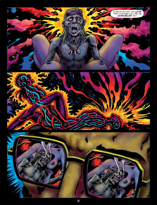
I became the colorist because, as Ian so eloquently opined, “it was inevitable.” While the book has its roots in horror anthologies like Eerie and Creepy, those books were black and white and I wanted to channel the psychedelic colors of Bava and Argento flicks. Our animated teaser got finished before the graphic novel, so that set the visual tone. The problem was, to do that level of color work – which is a totally separate consideration in comics – you’d need to find a colorist as deeply steeped and engaged in the material as I was. And for a brand new character and book, there just wasn’t anyone like that except me!
In the beginning, we thought Mike himself would color the book, but once we got into the art, we all realized the scope of the project was just too big for him to do both and stay on schedule. We quickly followed up on a few recommendations but they just didn’t work out. At that point we didn’t have the time, or budget really, to start looking for established colorists from scratch, so I volunteered my services! I’ve been working in art and digital post my entire life, so it was all in my wheelhouse — and I’d only have myself to blame if I didn’t like it!
Mike and I had slightly different ideas on color, so I was especially proud when he saw some finished pages and loved them. I like to think our minor difference in aesthetics added to the overall quality in the end. It’s not like a typical book by Mike Dubisch, but it’s undeniably The Doobs on acid! Scratch that — on MORE acid!
How do you feel about telling a story over multiple media?
That’s an interesting question – and I guess my short answer would be I love it! I mean, filmmkaing is telling a story through multiple mediums, as you’re writing it first, then storyboarding then casting and doing costumes and production design. So much art goes into the process, you keep refining the story through those various expressions of it. But telling a story across multiple media was a new thing for me, and I became totally engrossed in it in a whole different way.
My main concern when I started writing Murder Vibes was where to start, since I’d never intended this to be the first thing our audience would see. The world of PDB had grown exponentially, in all directions, over the course of several years. the origin stories of the main characters seemed an obvious place to start, but the proper framing story turned out to be an as yet unwritten episode which occurred after the events of Orgy of the Blood Freaks. For me, part of the fun was placing some easter eggs in the book that would only make sense to the audience after seeing (or reading) Orgy, but also taking them by the hand and introducing the world for the first time.
Graphic novels are no joke to produce independently – a ton of work goes into them – and learning about that process was a great eye-opener for me. I’m very fortunate to have the support of Dan Simpson and Diabolik partner Ian Mackay to allow me to work in this new (for me) medium. It’s actually not that different, creatively, from filmmaking. Comics don’t have the same limitations as film, where doing scene after scene of monsters from Tuscany, to Nepal, to Paris, would blow your budget to bits. Working in the graphic novel medium with artists like Mike, Emanuele, and Lydia gave me the opportunity to introduce the world of PDB is the most spectacular way possible, not worrying about “how will we shoot this?”. It was totally liberating, and as you’ll see – I took total advantage of my new found freedom! The book bounces back and forth in time, across continents, into the distant future, cramming monsters and action set pieces into every nook and cranny! There’s no way I could’ve ever gotten the budget to do that in film, especially for the first foray into a fledgling franchise.
My hope is that as we produce more PDB stories, either in film, animation, or graphic novel form, that each iteration will inform and enhance the others, and that we can utilize whichever medium works best for the particular story we want to tell.
What did you think of COLOR OUT OF SPACE?
I honestly thought it was a bit of a mess, especially the first act. Once it got going, it was pretty entertaining, but nothing I’d sit through again. Most of my firends dug it, but I promise I’m not trying to be contrarian! Just didn’t do it for me.
A comic without art is like a slasher flick without bodies, so Mike Dubisch is gonna tell us a bit about how he murdered the pages.
When you got on board with the graphic novel, did you get a stack of reference flicks or did you already have a clear idea of what you needed to do?
Phil gave me access to his massive image files and after that I just tried to complete his vision.
Were there moments when you had a different idea from what was in the script and pleaded your case? If so, did it work?
As a matter of fact yes. And I’m afraid it was moment dear to Phil’s heart, involving concurrent splattering of blood, brains and cream soup, and I lacked both stomach and rendering skills to the task. We reined it in a little and I hope Phil likes it, but I assume he’ll restore the original recipe if he ever films the scene 🙂
What kind of gear do you use to draw, and has it changed since you started professionally?
I am and have always been a traditional pen and ink illustrator, with a preference for watercolor/gouache with colored pencil for my color work. While I learned to ink with nib and brush I tend to ink with Pigma pens and Pentel brush pens these days.
Creativity’s a muscle that needs constant work. How do you stay creatively fit?
I’m like a soldier on the battlefield. Keeping up my game isn’t an issue, I’m just trying to stay on my feet with my weapon pointed forward.
Other then that, when I can, I like to start fresh projects, and especially keep up free form work that has no client or deadlines attached- when they are ready to finish I work on them alongside commission work, using them as warm up and places to experiment. I try to draw on location regularly, and life drawing from the model when possible. Key to quality is ambition- without some notion that effort must be made to make this next piece be better then the previous one, there is stagnation, and hack work. I don’t always succeed in rising above that, but without effort and vision, mediocrity is likely, and excellence out of reach.
What did you think of COLOR OUT OF SPACE?
I liked it. But the director’s earlier, less seen original Lovecraftian short film Mother Toad really does it for me.
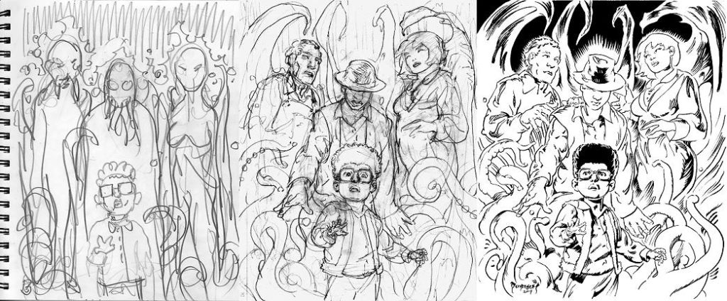
Mike’s process in creating page ten
You won’t find any so-boring-they’re-terrifying effects in Murder Vibes thanks to Lydia Roberts, and she’s gonna tell us why.
For those who need to know, like studio marketing execs, what’s the art in what you do and why is it important?
Well, as between working on the main titles and the sound FX I bring a few different aspects to the project. The titles have to be quasi-stand alone logos, should the letterhead need to be shown without any back up images, and they also need to vibe with all the preexisting art and general world-building that’s already happened between the writer and artist. It gives the consumers a quick intro to what they’ll experience.
With the sound effects, I’m like a warped foley artist and elaborator on onomatopoeias. Again I’m trying to meld in with the work of the writer and artist and bring an even more visceral nature to the readers. Good sound effects can bring you into the panel further without you realizing it just by adding that extra dimension.
Do you have a stockpile of fonts at the ready or do you wait for inspiration and hunt for what fits? [Lydia hand-letters with pencil and ink. PM]
I think somewhere I have a stash of printouts from back in art school… but I haven’t looked at those in years. Then there’s the adobe font library if I need something specific, or the internet for a quick look up. But honestly I mostly work off my mental map of different letter styles and investigate different fonts further as the project needs. I generally start with a few different styles that seem to vibe with the scene or story and we start narrowing it down from there. A lot of my favorite sources for font and lettering inspiration are classic movie posters and old-school sci-fi paperbacks, band posters of course also haha.
What are some lazily done movie titles you’d love to improve?
Hmmmmm. The original DUNE would be one. I have a soft spot for the book like so many other people do. Also I still mourn the Jodorowsky film that was proposed but shuttered. Speaking of, I WISH I owned that master book they show in the documentary with all the storyboards and character designs/world-building art. The new attempt coming out soon will be interesting!
TRICK OR TREAT is a classic I love. The original title I feel like I could have done a lot more justice to. And that movie is so great, I mean what’s not to love with Ozzy appearing as a televangelist and classic secret messages in records played backwards?
If I had a random third to choose…. its tough. Man so many classics actually have great lettering. I guess I’m gonna have to say something newer. What just pops into mind was that movie ANNIHILATION, its just got a basic standard font. I feel like there could have been more of the movie’s aspects brought in, even if it’s like ALIEN‘s font where it’s somewhat simple/animated aspects. But ANNIHILATION was a great movie that would be fun to do some lettering/poster art of.
What are four examples of great lettering (titles, sfx, or something else) and why?
I’ll just go through some of the movies that I like that come to mind. THE THING is one, the original is this craggy primal letters, all icy blue. You’ve got the ice that the thing was encased in, it’s violent and unknown tendencies, and the feeling of explosion/escape.
In the vein of horror movies reflecting their subject matter, really anything that TROMA puts out. They’ve got a great sensibility for putting the vibe of the movie in the title. Even somewhat simple ones like TOXIC AVENGER have a custom aspect. The blockiness and zoom give off that patriotic superhero vibe, but there’s this sickly green light underhitting the whole lettering.
Takashi Miike’s GOZU is a favorite, partly the lettering but also the movie [his self-confessed farewell to being a cult director. RK]. The bull-headed silohuette inside the O hints at the spirit lurking in the various stories of the movie, just under the surface. The letters are blocky, give off an ancient aspect, and are stiff and ominous. I feel like the dark oddities and japense gothic vibes really come through.
Aaand lastly, let’s see. I’ll go with a classic, SLEEPAWAY CAMP! It’s direct, but so awesome at the same time haha. The letters are all branches/sticks, and they’re all dripping with blood. Straight to the point! What artistry. Talking about all these has me wanting to rewatch them.
What did you think of COLOR OUT OF SPACE?
Sadly I haven’t gotten to see the movie yet. But I love the classic story! I have to get on that ASAP, especially with being home more often now.
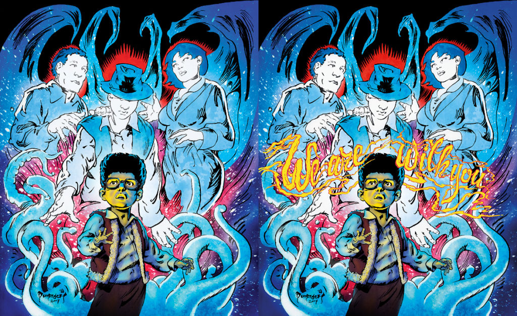
Page ten after Phil and Lydia got their hands on it
Here’s a set of three videos glimpsing Lydia’s process: of the Murder Vibes title, of a chapter title we can relate to, and of, well, The Bastard Birthright of Major Bitch.
Dan Simpson’s gonna fire walk with us between the world of movies and comics and explain how Dario Bava’s gonna slaughter them both.
What was the difficulty of figuring out how to make the book’s layout happen?
The layout was 100% Phil Mucci – he is the monstrous creative force on any of our projects. He wrote the story and then storyboarded the entire book like he would a film project. The structure and visuals are very cinematic… and it’s really one of the bigger underlying foundations of the book that make it truly unique. Phil also spearheaded the physical book specs as well – my main job there was just to encourage him to go for it. We wanted a tome that screamed quality and craftsmanship!
The illustrative team is pretty international. Was that a choice or a happy accident?
I hesitate using the term ‘happy accident’ on the book since, unlike the more roll-with-problems nature of a movie set (which is where I am familiar with that term from), everything has to be super deliberate on a printed book. If we are making film analogies, its much more akin to animation in that everything has to be meticulously thought out in advance or nothing ends up working. As a collector of weird art, toys, and other ephemera – I was already a fan of Emanuele Taglietti through a box of 70s blue Fumetti horror books I had acquired from Italy and had reached out to him about the possibility of collaborating in some way prior to this project. When Diabolik landed on doing a graphic novel for Professor Dario Bava, his was the first email art request I sent – and he graciously accepted! It really couldn’t have been more perfect how those stars lined up: Legendary Italian genre cover painter on board for period Italian themed horror graphic novel.

Here’s a video of Maestro Taglietti painting the cover
I had a super specific idea in my head of what I wanted the art in the book itself to look like… and that was more of a challenge. Not the art style itself as much as the tone and atmosphere from the horror comics and magazines I grew up with… to be transported immediately to a familiar vintage ominous fantasy universe. We looked at a ton of art as a team (Phil Mucci, Ian Mackay and myself) and while most of it was great, it was all just undeniably ‘modern’ for lack of a better term. I wanted to be living in the musty pulp world of an old Warren Vampirella, Creepy, or Eerie cover! Once I landed on Mike Dubisch, I knew he was not only the right artist for the job, but the only artist I had seen that 100% fulfilled the hard to quantify ideas in my head. It was another fortunate coup that he agreed to come on board as it was a massive undertaking at 70+ pages of original art.
The rest of the artists were really us as a team reviewing and being in full agreement on work that really knocked our socks off… so yea, in that regard it was definitely ‘happy’ that this lined up in a way that really felt like firing on all cylinders. No compromises were made in terms of talent… and thats a highly magical scenario for creating any comic or movie from the ground up. That we landed on so many international artists? Well, thats just a great perk of modern technology. The world just isn’t as constrained anymore on discovery or access due to distance or lack of elite channels. Everyone’s work is much easier to find and most people are directly approachable if you have a sound, professional track record.
What is the challenge of producing a graphic novel vs. a movie?
Most things carry over broadly – budget, scheduling, putting out occasional fires big and small. With film, there is this intense burst around the shoot – both pre-production and the actual on set production. So many moving parts on such a tight schedule. It is all about rearranging everything constantly to adapt to things as they happen, and then you take a breath and enter a phase of more deliberate heads down on post production (always knocking on wood of course). A graphic novel is much more of a long, drawn out post-production process. Making sure everything is getting done on all fronts is a continuous process…..and dealing with so much art coming in, dancing that fine line between respecting each artist’s vision with whats needed for the overall health and success of the final product. On an indie movie, the director has final word on creative things…and while thats not totally different on a graphic novel, it’s certainly more complicated.
How do you feel about telling a story over multiple media?
I couldn’t be more excited! From the moment we decided to take the character of Prof. Dario Bava and create a bigger universe, the project was designed to be modular. What I mean by that is that we shot a trailer, and designed the concept around whatever could get made at the time – movie, cable series, streaming shorts series, anything that had a spark of interest. Then Phil wrote stories that could be scaled up or down, chained together or split apart as needed….so we could be fluid in our approach to pitching the project. Our other goal was to be really be the stewards of these characters. We didn’t want to just sell it off to the highest bidder and walk away. As the pitching process moved forward slowly (which is normal), we collectively decided to move forward with with our own plan of making something ‘immediate’ that we could pull off in high quality fashion and the idea of a graphic novel really excited all of us! Two years and change later, Diabolik has a book we are super proud to show off.
None of us had experience in the production end of the comic world, but it was a super fun and challenging master class to just dive in and shoot for the stars. The entertainment industry landscape was already shifting quickly when we decided to do our own book. With the current Covid-19 situation, its about to change even more dramatically in ways none of us can really predict. With that in mind, our original plan of fluidity is even more primed – more comics and an eye towards stories told by streaming projects, novels, film strips, smoke signals, semaphore flags…whatever! Always with a laser specific focus towards making it all work together seamlessly and taking advantage of each mediums strengths. This is also why the graphic novel is not just re-telling the existing stories we created to film, but to exist in tandem with them. Entertainment served at home thats affordable and easy to access just got a nitro-charged boost due to extended shelter-in-place rules, rocketing the entire format class to a much larger piece of the established media pie and hopefully there is a slice of that for us.
What did you think of COLOR OUT OF SPACE?
I personally had a great time watching the movie! Whatever the filmmakers claimed in terms of being authentic to classic Lovecraft, the movie itself felt like it had a direct DNA strand to the 80s Stuart Gordon Lovecraft films which were like genre bibles to teenage me – they led to me discovering a whole slew of previous AIP adaptions when I was pretty young and not quite a full fledged vintage film obsessive. The crazy, psychedelic DUNWICH HORROR, THE HAUNTED PALACE, and the visually amazing DIE, MONSTER, DIE (also based on The Colour Out of Space). I was nervous about Nick Cage sort of overdoing it, and his somewhat restrained performance worked really well. I also loved Tommy Chong and thought Richard Stanley’s witchy flourishes were fun! My old friend and Severin Films head honcho David Gregory was a producer on the film as well…so there is a lot to like for me. Its also great to see a truly low budget genre film like this get a large audience!
Phil and the gang are treating the Daily Grindhouse family to a discount on their site. Check it out for a free preview of Murder Vibes and once you’re hooked, peep their wares and use this fitting code for 30%-OFF everything: GRINDHOUSE.
Tags: Comic Books, Interviews

No Comments