Are you a comic book fan? Chances are good that many of you Daily Grindhouse readers out there are. You’ve got taste! Are you the kind of comic book fan that has a favorite character? Do you remember the first comic book that caught your eye?
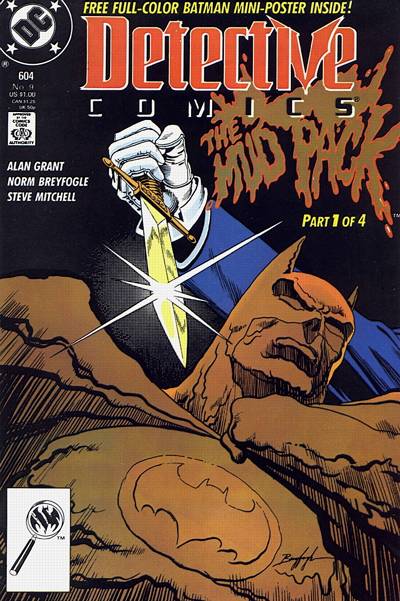
Personally, I can’t remember exactly when I started loving Batman, and I concede that must have had plenty to do with reruns of the silly old Batman TV series. But that’s exactly the point. If all a kid knows of Batman is gaudy colors and 1960s swinger character actors camping it up, then imagine what that kid might think when he encountered this cover:

I can’t be sure exactly which comic book got me into collecting comics avidly, but I know for a fact that this cover was there at the start for me. There you see Batman caked in oppressively brown clay, his iconic chest symbol crusted over. Batman seems frozen in place in an uncomfortable way, and to make matters worse, a Sword of Damocles is literally dangling overhead, as a maniac brandishes a golden dagger right above that big-ass target.
With all the onscreen and in-panel murders and manglings I’ve seen in the intervening years, no doubt this image is relatively tame. But thinking back to being a sweet kid with an unclouded heart, I can remember the impact. It didn’t scare me away, exactly, but it did scare me. It drew me in. That was 1989. The comic book cost one dollar! The habit cost me many more dollars since.
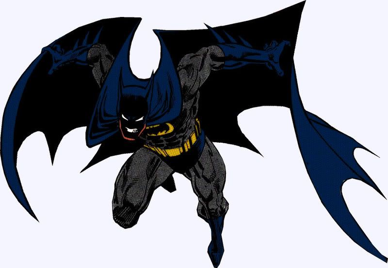
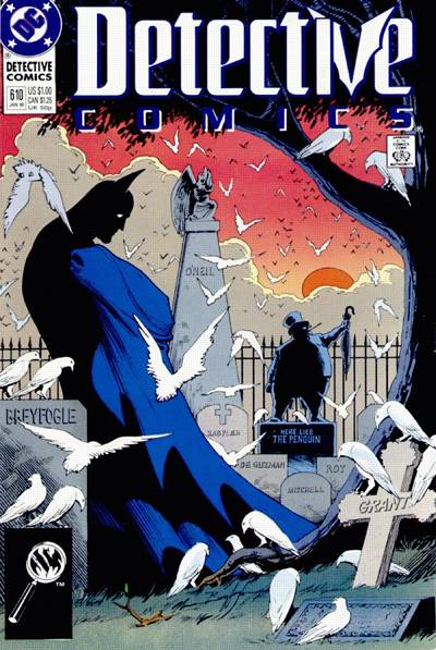
The artist who drew that cover is named Norm Breyfogle. He penciled Batman comics fairly regularly from the late 1980s into the mid-1990s. Breyfogle’s style was a perfect fit for the character in many ways. His work was somewhat reminiscent of seminal 1970s Batman artist Neal Adams, but more streamlined and compact, in a way that anticipated the appeal of popular 1990s artists like Jim Lee and Todd McFarlane. He frequently drenched Batman’s cowl in so much shadow that only the white pupils of his mask and his gritted teeth were visible. Breyfogle’s work can ferociously grab the viewer’s attention without losing the essence of the character he’s depicting.

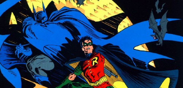
Batman is a character who is supposed to strike fear into the hearts of cowards and criminals, yet he’s not supposed to scare kids, who know he’s on their side. Breyfogle drew a spooky Batman, but his villains were downright frightening. By comparison, Batman was the least scary thing in the books. His Joker was convincingly, horrifyingly deranged, unbound by linear compositions. His Penguin was deviously malevolent. His Two-Face was creepy and untrustworthy from either side. Clayface, a potentially silly bad guy, was unpredictably amorphous and dangerous-looking in Breyfogle’s hands. As you can see in the cover below, his Scarecrow was unnervingly featureless, and he could even make Robin look like a straight-up bad-ass.

I wish I was composing this article merely as a fond tribute to an artist who inspired my dreams and nightmares, and hopefully it can still be that. But the main reason is because Norm Breyfogle has suffered a stroke, resulting in the paralysis of his left hand — his drawing hand — not to mention impeding on his ability to walk. Like many creative people, he is uninsured, and we are surely all too well acquainted with the exorbitant costs of medical care in this country.
Norm Breyfogle’s loved ones have started a fund to raise money for his medical care.
Click here to contribute.
If you can spare even a couple dollars, it’s a great cause. Let’s do what we can to get this man drawing again.


- [THE BIG QUESTION] WHAT’S YOUR FAVORITE FEMALE ENSEMBLE IN MOVIES? - July 22, 2016
- [IN THEATERS NOW] THE BOY (2016) - January 24, 2016
- Cult Movie Mania Releases Lucio Fulci Limited Edition VHS Sets - January 5, 2016
Tags: Batman, Comics, Film News, Good Deeds, Norm Breyfogle


No Comments