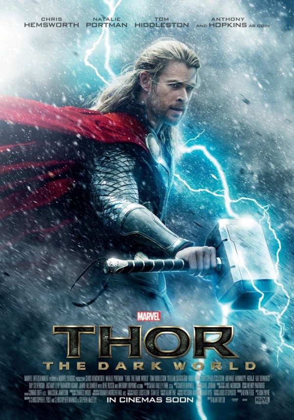
The new poster for THOR: THE DARK WORLD has arrived and man, this thing is crap. There is nothing inventive or unique about this poster. The Marvel films have done a great job of creating anticipation and delivering the goods in spades but this is junk. It gives you zero hint of story, a poor picture of the character, and the title colors don’t match the rest of the image or tone. I’m curious about this movie but man, step it up in the one-sheet department.

Latest posts by Jon Abrams (see all)
- [THE BIG QUESTION] WHAT’S YOUR FAVORITE FEMALE ENSEMBLE IN MOVIES? - July 22, 2016
- [IN THEATERS NOW] THE BOY (2016) - January 24, 2016
- Cult Movie Mania Releases Lucio Fulci Limited Edition VHS Sets - January 5, 2016


No Comments