
I get uneasy when things advertise themselves as being “grindhouse.”Typically, it means the creators just throw as much gore, nudity, and sexual content in the mix, so it comes off as shocking without any sort of substance to it. There’s nothing wrong with that at all — I’m a big fan of stuff like Johnny Ryan’s PRISON PIT after all — but it takes a certain sense of self-awareness and commitment to pull it off while feeling genuine. Thankfully, M.L. Miller’s GRAVETRANCERS pulls this off with great success and left me wanting more by the end of the first issue.
It’s hard to explain GRAVETRANCERS without giving too much away, because one of the main reasons I enjoyed this first issue was how it kept me guessing. In the most basic sense, the comic is about a brother and sister, Anthony and Maribel, going to visit the grave of their father. There is some unfortunate family history there, which leads to some great dialogue between the siblings that makes them likable, the kind of people you really don’t want to see suffer a terrible fate. Of course, the visit turns into something much darker, when they find themselves the guests of a bizarre family that watches over the place with a much more sinister purpose in mind. I’ll leave at that, because as I’ve said, the suspense of finding out what will happen is a huge part of this book, at least for this writer. It honestly felt like reading an old E.C.-era horror comic akin to TALES FROM THE CRYPT, albeit with some much more stylish artwork.
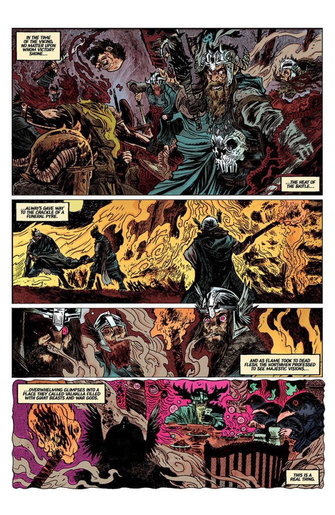
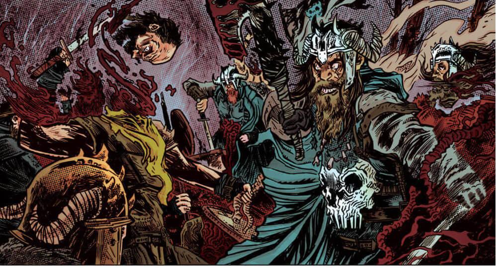
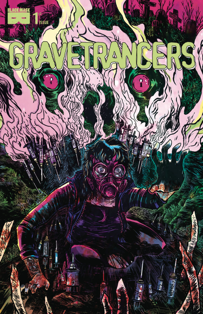
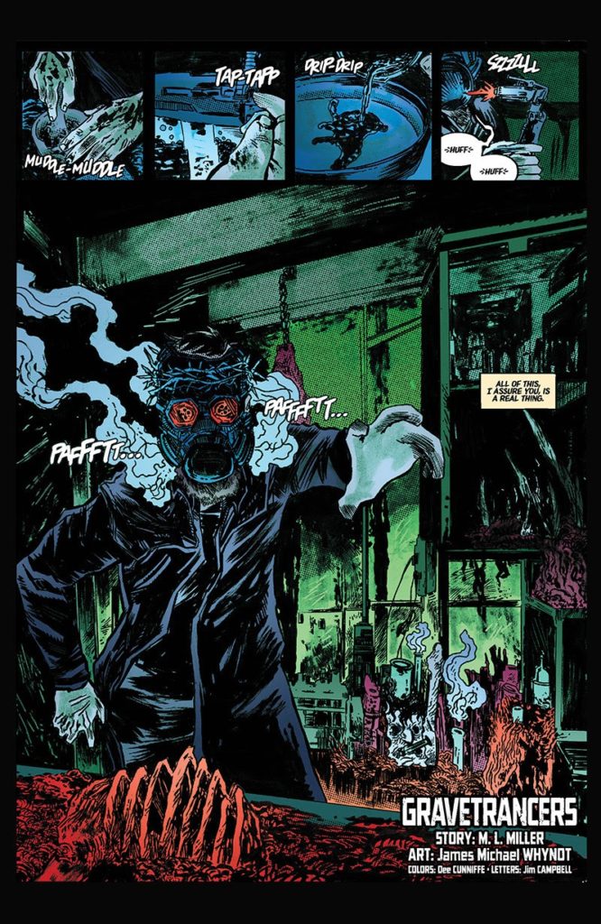
Speaking of which, the artwork in this comic is fantastic. Right from the cover, James Michael Whynot’s art grabs your attention and doesn’t let go, with a sketchy yet refined style that emulates the grindhouse feeling incredibly well. Characters have a cartoonish quality to them without being too silly-looking, so as to take the bite out of the storytelling. It’s suitably grim and morbid while being appealing, due in no small part to the color choices by Dee Cunniffe. The mix of neons with darker colors makes the panels pop, while still keeping that all-so-important unsettling tone. I know I wouldn’t mind having a larger version of the cover on my wall to just marvel at the detail and joint craftsmanship on display.
If you couldn’t tell, GRAVETRANCERS is definitely worth picking up. One issue in, and the story has its hooks into me, to where I can’t wait to get my hands on the next one to see where it goes. You’ve got characters to root for, creepy and unsettling antagonists, and suspense and gore, all wrapped up in a stylish package. Plus, bonus points for the story being inspired by an incident from Chicago history — as a native, it’s nice to see something morbid inspire something so creative and intriguing.

- [REVIEW] METALSTORM: THE DESTRUCTION OF JARED-SYN - September 14, 2016
Tags: Black Mask Studios, Chicago, Comic Books, Comics, Dee Cunniffe, Gravetrancers, Horror, James Michael Whynot, M.L. Miller

No Comments